I knew this re-design was going to be bright, but not this bright. Dang! It’s bright! Besides the brightness and that it’s less pretty than the last version, I like this version more than the last version because this version gives me a feeling of openness. Also, I re-designed (this time) for a more usable layout.
With this re-design, several things have changed about the layout. Instead of two menus, one on top and the other at the bottom of the header, WPDesigner now has only one simple menu beneath the blog title.
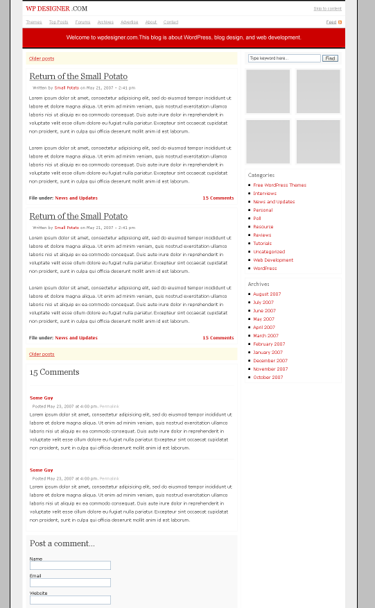
The search form is easier to find; it’s sitting at the top right-hand corner rather than within a header. Third, the theme thumbnails at the top are no longer there. Some of you told me that you simply passed over them to get to the blog posts so the theme thumbnails were actually useless on the home page.
Fourth, this design features 125 x 125 button banners instead of the 234 x 60 half banners for monetization. (Contact me if you’d like to advertise on this blog.)
The main color also changed, obviously. (Come over to the red side with WPDesigner!) Do you prefer blue or red? What else about this re-design do you like or not like?
In other news: After two and a half years, Problogger is getting a facelift too. Read my Problogger design review (of the old design).