Darren Rowse’s Problogger.net is first on the chopping block for the new WPDesigner review series, which intend to help you spot drawbacks and areas to improve on your own blog.

Speed
According to WebsiteOptimization, Problogger.net takes 92 seconds to load for 56k users. Despite more and more users making the switch to broadband connection, it’s important to cater to 56k users, regardless of your target audience.
To decrease loading time, Darren could:
- Make MyBlogLog avatars smaller or lessen how many avatars to display. I’m sure a lot of blogs have had problems with My Blog Log (take NetBusinessBlog for example).
- Limit the size of sponsored banners. One of the button banners (125 x 125) on Problogger is 54kb. The rest of the button banners are between 8kb and 15kb.
- Decrease the size of in-content photos and images. Darren’s photo with Guy Kawasaki and Jeremy Shoemaker is 159kb. Open that photo in Photoshop, select Save for Web, then adjust the options for optimum size and quality.
Despite the fact that some users don’t actually come to Problogger for content (RSS subscribers), Problogger does get well over 100,000 unique visitors per month. For sure, a portion of that number are 56k users.
Cross Browser Issue
Unlike WPDesigner, Problogger.net doesn’t look the same in both Firefox and Internet Explorer. (Don’t burn me for not testing with other browsers. I don’t have time for it. Thanks.)
Here’s Problogger in Firefox:

Here’s Problogger in Internet Explorer 6.0:
Colors
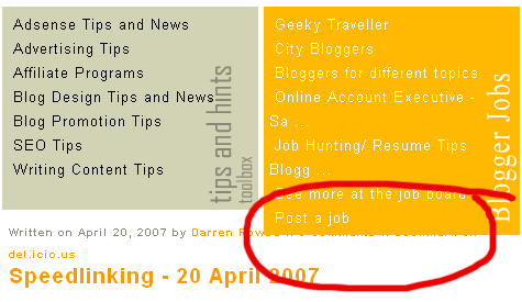
Other than the main content, which is black text on white background, Problogger is hard to read. Also, the main link color, orange, isn’t dark enough.
- The three blocks, at the top, to highlight top content on Problogger are hardest to read. It’s great that Darren highlights the most popular content on his blog so they don’t get lost in the archives. And yes, your eyes should gravitate toward the latest content (below those three blocks). However, that shouldn’t be an excuse for using white on gray, gray on gray, and white on orange color schemes.
- The sidebar doesn’t have enough contrast and contains mainly links. If that’s the case, why not make those links darker?
Missing and Broken Features
- Problogger’s individual post pages are missing the next and previous links. That’s probably because of the WP-Pagenavi plugin that Darren uses to generate the pagination-by-number on the front page.

The WP-Pagenavi plugin doesn’t work with single post pages. Darren needs to revert to using the previous_post_link() and next_post_link() functions for the single.php file.
- Also on individual post pages, the text-area for the comment form is too wide. In Firefox, that’s not a big problem. But in Internet Explorer, here’s how Problogger comment form looks:
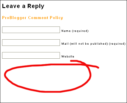
Where is the box where you type in the comment? It’s at the bottom of the page. That’s what happens in Internet Explorer if your text-area or comment box is too wide.
Search Engine Optimization (SEO)
Although the Problogger theme follows WordPress’s structure, which is pretty good, SEO-wise, Problogger isn’t optimized for search engines (specifically Google).
- For one thing, you want to use only one set of H1 tags. And, you want those H1 tags to wrap around the title of your page or blog. Problogger has mutliple sets of H1 tags. And each set wraps around… a date?
 That’s exactly how you should not use H1 tags.
 - Second, Problogger’s sidebar content and practically everything else come before the main content. Ideally, you want the search engines to pick up the main content before the sidebar or anything else. This can be fixed by using CSS.
- Make the sidebar column come after the main column, in the source codes.
- Use CSS to make the main column and sidebar float right, instead of float left. Or, simply make the sidebar float left without applying the float property to the main column.
- On the outside, you’ll see no difference. But now you have a left sidebar that comes after the main content. You’ll see a left sidebar. But to search engines, it’s now a right sidebar.
