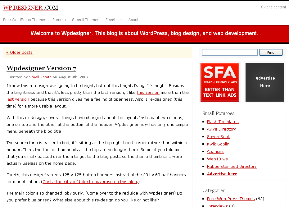
After reading all the suggestions and opinions, I’ve made a few changes to this new version of WPDesigner.
Here are the changes:
- added a favicon
- darker background color
- simple horizontal navigation, that looked like an Adsense Ad, converted into a tab-like navigation with a pop-up effect on hover
- added RSS feed links to the top navigation
- borders around several elements that didn’t have borders
- alternating background colors for comments
- less cluttered entry meta area
- two Fam Fam Fam icons added to entry meta
- a softer red for link color
Now, I am aware that the old design is much better looking than this design, but uglying up my blog for a more simple and easy to use design was why I re-designed it. Maybe another web designer could improve usability without giving up all the graphics, but I don’t have the skills and time to do that, at this moment.
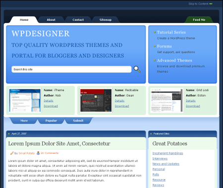
I’ll continue to tweak this new design to make it perform and maybe look better too.
Below are several items on my to-do list:
add a logo– added my photo to the sidebarcreate a page dedicated to the best content of this blogadd excerpts of most popular content to the sidebar or the footer- customize the red blog description area to output different messages based on the area of the blog you are using
add a color switcher for users that don’t like red
Layout bug(s):
- Horizontal negative margin – While implementing the pop-up effect for the horizontal menu at the top, I came across an Internet Explorer negative margin bug. As far as I know, there’s no workaround or hack for this bug. Fortunately, the menu is visible and still works in IE.