 Welcome to another edition of WPDesigner Weekend Must Do (WWMD). For this weekend, you must reduce your blog’s bounce rate.
Let’s say you’ve paid $100 to get 400 new visitors to your blog and 200 of them left without doing anything. How do you feel about that? Even if you’re getting free traffic, you should be worrying about reducing your bounce rate. You could be losing those visitors forever.
What is a bounce rate?
Basically, if your blog has a 50% bounce rate then it means 1 out of 2 people left your blog without visiting another page. Yes, they simply left without clicking on one single link.
By the way, anything higher than zero percent is unacceptable. You should always work on reducing the bounce rate.
How do you reduce the bounce rate?
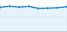
First, let me share my bounce rate statistics.
- July: 52.10%
- August: 50.17%
- September: 48.36% (so far)
Since July, WPDesigner’s bounce rate went down 3.74 percent. So now you know, it’s possible. Keep reading to find out how I’m doing it.
Before you can reduce it, you need to know what affects it. The main factor is targeted traffic. If you’re not getting targeted traffic then people are leaving your blog because it isn’t relevant to what they’ve searched for.
Targeted traffic alone depends on several factors. But basically, it’s going to be hard to get targeted traffic if your blog covers a wide range of topics.
If your blog doesn’t cover many topics at all and you’ve done a good job with sticking to your niche then maybe you need to:
- make it look the part. How do you feel about a technology blog looking like a food blog?
- sprinkle your keywords throughout your blog, in the blog title, description, post titles, content, categories, and sidebar titles.
- get other blogs to link to you using the keywords that you want them to use.
There are many other factors that can affect your bounce rate. For examples: Is your blog’s too text or graphic heavy? Do you run pop-up ads? Is your best content visible?
Other ways to reduce bounce rate
 Design wise, you should make sure your blog is balanced, if not well-balanced. Most of the times, blogs are text heavy. Text heavy pages don’t capture the visitors’ attention and that’s a problem.
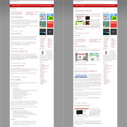
To the left of this paragraph is a side-by-side comparison of the before and after of WPDesigner. If you haven’t noticed, I’ve been adding a relevant image to each new blog post. You should do the same. On the other hand, I’m aware that not every blog design or WordPress theme allows room for an image with every post on the front page.
That’s okay, but you’ll need to make sure that your design or WordPress theme has enough graphics and/or icons to balance out your text-heavy front page.
Beside using more images in the blog posts, I’ve also redesigned WPDesigner to put the best content forward.
Ideally, you should optimize every single page of your blog to reduce the overall bounce rate. But for this weekend, focus on the front page.