In my last tutorial, I explained some of the reasons behind the use of various line lengths, known as a column’s measure. I mentioned that a column’s line-spacing, or leading, plays a significant part in the choice of a line’s length. Line-spacing plays an important part in a lot of things typographically, as I’ll explain.
The first thing we have to recognize about line-spacing is that there is no one perfect setting. Each circumstance calls for a different use, so the trick is to find the basic principles involved.
So what is line-spacing to begin with?
Line-spacing, also known as leading, is the white space between each line of type in a paragraph. Adding or subtracting from this white space greatly effects the readability of the text, and being able to set it properly is essential to the readability of the design.
In CSS terms, line-spacing is known as the the
property.
-
style=”line-height:normal;”
-
style=”line-height:1;”
-
style=”line-height:1em;”
-
style=”line-height:100%;”
The line-height property value can be set in a number of ways as follows:
-
style=”line-height:normal;”
This will set the text to the default setting, if, for instance, you specified a strange line-height somewhere in the cascade above it.
-
style=”line-height:2;”
You can specify a number to act as a multiplier. This number is multiplied by the font size to determine the line-height. For example: if your font size is 12px, 12px times 2 equals 24px.
-
style=”line-height:1em;”style=”line-height:1pt;”
You can use standard measurements to set the line-height value:
-
mm
(millimeters)
-
cm
(centimeters)
-
inch
(inches)
-
em
(ems)
-
pc
(picas)
-
px
(pixels)
-
pt
(points)
(In particular, if you’re creating a scalable design, the use of
emscan help prevent it from breaking if the size is changed by the user.)
-
-
style=”line-height:1%;”
Finally, you can use a percentage of the typesize, including the % sign, as the value for line-height. For example, if your text is 10pt and you set the percentage to 120%, the line-height will then be 12pt. The default line-height setting is typically this amount, unless specified otherwise.
The default line-height setting does not always equate to being the ideal line-spacing, so as a designer it is your duty to specify the correct one. How do you determine that?
The longer the line, the greater the line-spacing needs to be
Remember, we read left to right. Readability is enhanced if we leave an easily discernible trail for the eye to follow. Adequate line-spacing helps the eye to travel along the text smoothly, without hesitation or thought.
Using images from the previous lesson on column widths, we can clearly see that the second well-spaced example is much easier to read because the line-spacing is more appropriate for the line’s length.


Shorter column widths allow you to use tighter line-spacing than you can, or should, use on larger column sizes.
The x-height of the type specified affects the line-spacing
A typeface’s or font’s x-height is the ratio of the lower case letters to the upper case letters. This effects the perceived size of the typeface. Two typefaces, or fonts, can have different x-height ratios, making one appear larger than the other, even if both are set to the same point size.
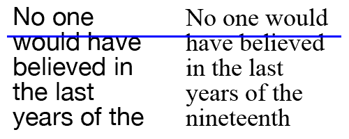
Notice how Helvetica, on the left, has a larger x-height ratio than Times New Roman, on the right:

The Times New Roman font thus appears to have more line-spacing, when in fact both typefaces are set at the exact same type size and the same line-spacing.
This means that a typeface with a small x-height can use less line-spacing because of the additional white space that is built into the font. Larger x-heights, however, require greater line-space to make the perceived white space adequately readable.
There is no one correct way to determine the proper line-spacing to use in a particular setting. The best bet is to use the greatest tool available to you, in designer-speak known as the “Mark 1 Eyeball.” Use your eye, and if it looks too tight, then it is. If it looks too loose, tighten her up a bit. Whether out of ignorance or out of laziness, too often designers fall back upon the default settings. If your determination is to create a design that is both useful and beautiful, then make sure to adjust your line-spacing appropriately.