This is the first in a series of tutorials on how to increase the readability of your web design using available typographic knowledge.
As noted previously, fluid or liquid designs can aid tremendously in the design of a page. But if you’ve ever tried to follow a long discourse that someone has posted on an internet forum, you quickly realize the major disadvantage:
It’s hard to read.
Column widths, or their “measure” in design-speak, have a tremendous impact on the readability of a particular design. While no hard and fast rules exist, there are two not-exactly-rules that you can follow to make your designs as readable as the daily news.
Non-rule #1
Don’t make your column measure too short.
Easy, right? But why? You first have to analyze how we read the English language. We read left to right. Words are aligned horizontally on a baseline that allows our eyes to flow smoothly from word group to word group. Our aim is to aid this normal horizontal rhythm of reading.
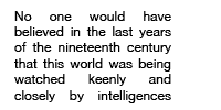
If your columns are set too narrow, you break up those word groups more than is necessary, to the extent that they break into individual words. This slows down the understanding and the comprehension of the text, making it harder to read.

And heaven forbid that you set a narrow column justified because the uneven breaks created in a justified text are quite possibly the worst thing you can do for the readability of your column.
Non-rule #2
Don’t make your column measures too long.
As discussed above, long column widths are the bane of forums around the globe, but why?
What happens when a line is too long is that we have difficulties finding the start of the next line because our eye has to travel too far.
We read top to bottom as well as left to right, so we jump down a line back to the left hand side to start again when we reach the end of a line of text. Have you ever skipped a line when reading something and had to start over? Odds are that the column was too long. The delineation between the end of one line and the beginning of the next was not made clear enough by the designer.
Another thing that happens when your column is too wide is that the even flow of left to right can be disrupted by the patterns set by the text. With insufficient leading, or line-spacing, we can tend to lose our place in the sentence by being distracted by the words in the lines above or below.

Your job is to make it obvious where one line ends and the other begins, and too large of column widths makes this difficult.
Set the line length according to the size of the primary typeface used for text matter.
What type size have you specified? The larger it is, the more legible it should be, up to a certain point. Given the proper line-spacing, which will be covered in the next tutorial, you can effectively allow longer column widths than would otherwise be possible with a smaller typeface.
Notice how the text below, although as wide as the examples above, is easily read.

Set the line length according to the amount of text used.
Are you writing a novel? Or is all of your content going to be single line blurbs? A few lines of text set very wide can be easily read.
The example below is easy to read because even though the measure is large for the text, our eyes can easily tell where they are going without difficulty.

If this were to be much more text, like the example below, it would be very hard to read.

Set your column measure according to the content.
Is your content technical data that requires heavy concentration or a narrative that allows for contemplation and a slower pace? If you open your newspaper, you will notice that the Opinions section typically has larger column widths than Page 1. That is because each Op piece is meant to be read slowly and digested. Page 1 is meant to be read fast, for instant information communication.
These are both degrees of “normal” column widths, so don’t get carried away.
Color affects how long you can make a line.
Color contrasts effects how fast the eye tires when reading. Too much or too little contrast can cause fatigue, thus presenting the need for a narrower column. I’ll cover more of the readability issues of color in a later tutorial.
Breaking up your text using subheads, dropcaps, and the like allows you to use longer column measures.
Newspapers again use this to great effect. Take away the big bold headings, the bold subheads, the pull-quotes, etc., and what do you have? A big hunk of boring gray text. The rule in newspapers is to never have a section of text larger than a dollar bill that isn’t touching an image, a heading, or something. Anything to break up the text will make it more readable.
Breaking up the text accomplishes two things. One, it makes your paragraphs smaller, making the principle stated above about the amount of text more relevant. Two, it gives the reader more opportunity to “enter the text,” meaning it gives the reader more places to start. This help their eyes with their navigation, meaning that the text is less tiring and easier to read.
Leading, or line-spacing, greatly effects your column width.
I’ll go into line-spacing in another tutorial, but suffice it to say that greater line-spacing allows for wider columns. The following examples differ only in their line-spacing:
Example 1 – Bad

Example 2 – Good

According to Robert Bringhurst in his Elements of Typographic Style, § 2.1.2, widely regarded as the Bible of typography:
“Anything from 45 to 75 characters is widely regarded as a satisfactory length of line for a single-column page set in a serifed text face in a text size. The 66-character line (counting both letters and spaces) is widely regarded as ideal. For multiple column work, a better average is 40 to 50 characters.â€
As simple as they may appear, column widths play an important part in the readability of text, and thus must play an important part in the creation of our designs. Stay tuned for more tutorials on the theory behind Web Typography.