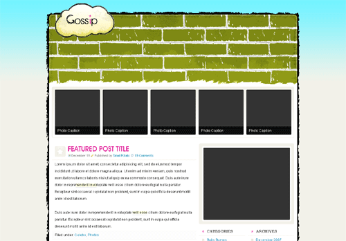
Below is the design I’ve been working on. (See previous versions.) Today was the first time I created an integrated original graphics. Although it might seem amateurish to the trained eyes, the INCOMPLETE piece below is significant (for me) because I’m an XHTML and CSS coder, not a graphic designer.

The header is HUGE at this point because I’m not finished with the illustration. Once it’s finished, I’ll shorten the header or green area to a more… reasonable height.
What I have in mind for the illustration is a car driving toward the top right corner of the layout with smoke floating toward the top left corner, which leads to the big cloud or logo. The background below the car layer would be some roads, hills, maybe the HOLLYWOOD sign, and some buildings.
As if graphic design isn’t enough frustration, trying to convincingly mix several styles into one design during my first crack at graphics design isn’t helping. Usually, graphics designers, like web designers and coders, have collected resources like brushes, textures, vectors, and etcetera to speed up the graphic design process. Me, I’m trying to do all of it the first time around and mix several styles at the same time, which are definitely not… smart practices.