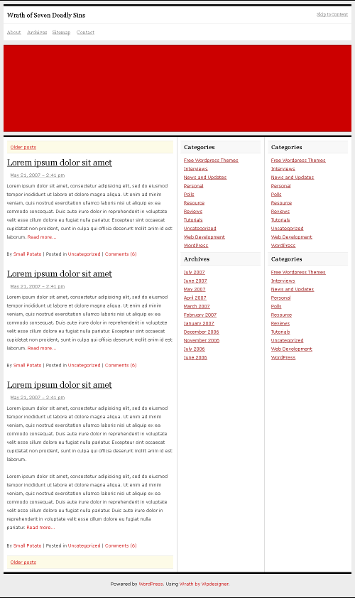
Click on the image below for the full preview.

Like always, details are not there yet. If you haven’t noticed, this design is based on Sandbox‘s structure. Initially, I’ll release it as its own theme because I have another use for it. Then, I’ll try to release it as a Sandbox skin, no guarantee.
Wrath is a three-column, sharp, minimalistic, but bold theme. 980 pixels wide, it has a lot of breathing room. I’d love to use it for WPDesigner, but I’ve given WPDesigner too many facelifts already in 2007. With that said, I’ll envy any blog that gets to use this theme.