Below is a list of my favorite Sandbox skins from the Sandbox Design Competition, listed in alphabetical order. I included notes written about each one while judging for the competition. View all 46 skins. Which ones are your favorites?
(The competition and judging period is over. According to the guidelines for judges, I’m allowed to publish this post. See who won.)
Diurnal
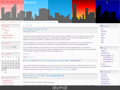
DIURNAL PROs:
- Well spaced
- Fluid width
- Valid CSS, light weight
- Use of CSS imports for additional features
- Wide image doesn’t break layout
DIURNAL CONs:
- No dropdown menu
- No skip link
- Problem with padding-top in IE
- Lack focus
- Inconsistent ordered list padding for comments template in Opera
Milkia
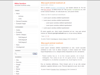
MILKIA PROs:
- Very clean
- Well designed sidebar
- Valid CSS
- Nice comments template, love the subtle difference for .alt
MILKIA CONs:
- Lack color
- Hidden skip link
- Could’ve been fluid
- Post meta is cluttered
- Post title padding is offset by 2-3 pixels
- Sidebar links are not underlined, no difference between text and links in the sidebar
- Repeated use of borders for fixed width elements
- r{} selector doesn’t exist, should be .r{}
- No drop down menu
MIX
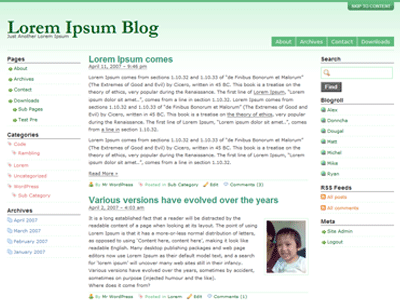
MIX PROs:
- Big bold title
- Use of drop down links
- Nice icons
- Easy to read post title font
- Valid CSS
MIX CONs:
- Poor spacing
- Use of Creative Commons icons in GPL theme. Is dual licensing allowed?
- No styles for blockquote
- No max width for images
- Same text and link colors
- Link state also does not change on hover/mouseover
- Wide image breaks the layout
- Design isn’t complicated but it’s fixed width
- Extra spacing in CSS organization
- Not a unique design
Prima
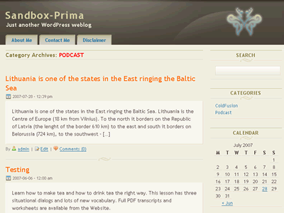
PRIMA PROs:
- Nice color scheme
- Good post title font
- Nice icons
- Pretty comment form
- Unique 2 to 3 column hybrid theme
PRIMA CONs:
- Sidebar feels empty
- Blockquote is not obvious
- No max-width for images. Settles with overflow: hidden
- No drop-down menu
- Invalid CSS errors
- No widgets styling
SandPress
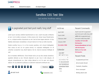
SANDPRESS PROs:
- Very pretty and unique design
- Nice pagination buttons
- Beautiful icons. Original?
- Widget styling
SANDPRESS CONs:
- Too much header padding
- Bloated CSS workaround for date button
- Too many images to load for the date button
- Incomplete search form styling
- No drop down menu
- Aside category template lack proper right padding
- No max-width for images
- Logo should be clickable (no obvious home page link)
- Menu items are too far apart
Walk in the Shadows
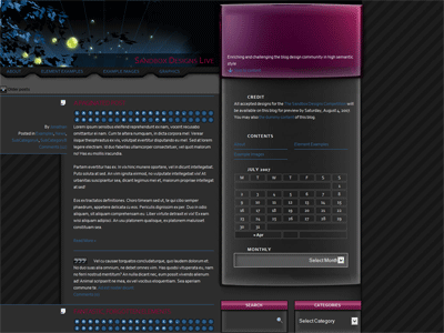
WALK IN THE SHADOWS PROs:
- Very unique!
- Nice date stamp or layout
- Unique footer
- Unique post meta listing
- Pretty blockquote background image
- Use of max width for images
- Widget styling
WALK IN THE SHADOWS CONs:
- Broken archive, category, and author layouts
- Not enough contrast for sidebar links
- Custom search form is not obvious, looks like an empty box
- No drop down menu
- Invalid CSS
- Bloated CSS reset
- Layout is broken in IE6
Clarification about my repeated note on bloated CSS reset, if you’re going to reset that many tags, you might as well use * { }. That will reset everything; I’m aware of that. However, it will negatively affect only a few tags that you don’t want to reset. You can always re-reset later on for specific tags. That method will take up less room, less bloat. Reset a few or reset everything.
Congratulations to the winners. Also, I’m glad I served as a judge because I got a chance to take a sneak peak at how to run a competition from Scott Wallick.