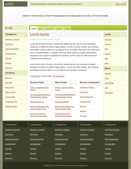
 Since the sketch or wireframe, I added a banner and moved some things around. Usually, a WPDesigner theme has a lot of rounded corners. This theme has no rounded corners because I’m aiming for fixed-fluid width, without bloated DIV wrappers. So far so good, but I don’t like the color scheme. Do you have a better color scheme for this theme?
Coding starts tomorrow.