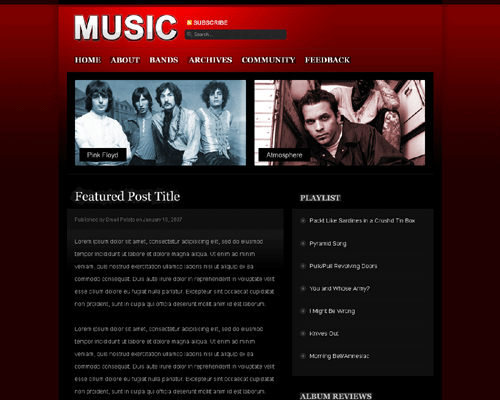
This is a dark design so the preview image above doesn’t really do the design justice in terms of details. Especially for future themes club members, this is your chance to let me know what you like and don’t like about this one.
Color-wise, it’s simple. Obviously, I went with red to make it pop, but you can easily switch out the red if you have the .psd file, which you will.
At this point, I’m finished with the background and basic structure. Next is adding more graphics (music images) and the final touches.
This theme/design does not come with photos used in the preview. They’re placeholders.