Design Concept
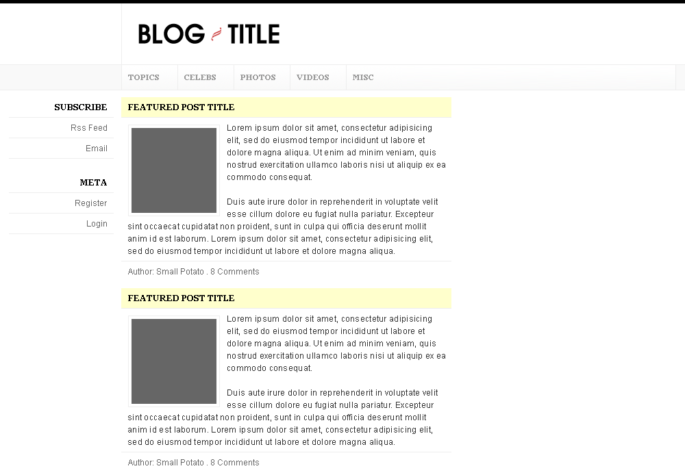
Lately, I’ve been working on a blog design for gossip blogs. You can click on the thumbnail to the left for a larger view. The preview image is only a rough layout.

It’s supposed to be a grid-based four column theme, perfectly sized for BlogAds advertisements. But, I guess I’m experiencing designer’s block and can’t seem to move on from what you see in the preview. Its style is a mix of Subtraction, Virb, Apple, and the previous 5thirtyOne design.
Ramblings
- As theme authors strive to turn WordPress into a CMS, WordPress themes get more and more complicated. Are theme authors thinking about the users? How easy is it for someone to use and modify your theme? Can their established blogs, with many different types of content, adopt your theme?
- Although I prefer to read content from a three column layout with the main column centered because my eyes naturally gravitate toward the center of the monitor, I’m starting to see the usability advantage of a left-aligned main column.
- Justin Tadlock recently released one impressive Structure.