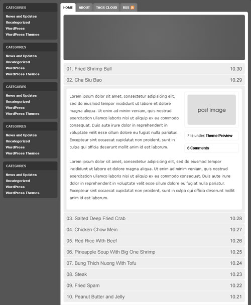
Gluttony’s expandable food menu looked too much like one of my previous themes (Braintied) so I tweaked it and somehow ended up with a two column theme.

Unless I change my mind to do another revision, I’m finished with the basic layout. Next is adding the details and coloring it. I have an idea of what I want, but it’s not clear. It should look warm and earthy at the same time. However, yellow, green, and brown might not be the best combination for this layout. Check out the revision.