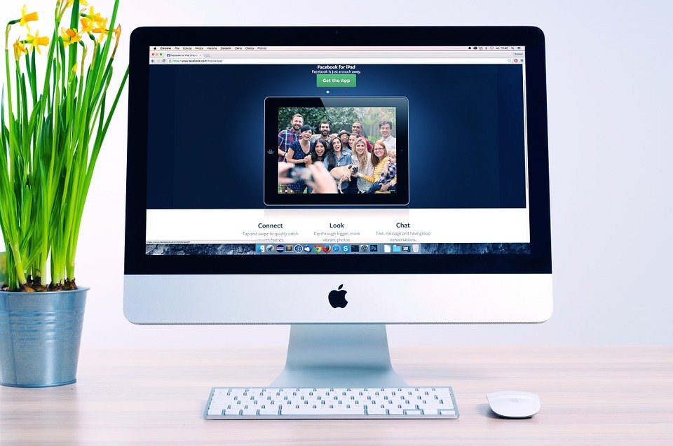
Web designers in the past mostly used 3D styles for buttons that made the button seem more realistic. That all changed when flat design entered the game. It was mostly popularized by Microsoft in 2011 when they introduced Windows 8.
Flat design has been spreading like wildfire since Microsoft released Windows 8. But, as any other design, it came to replace something.
What is Flat Design?
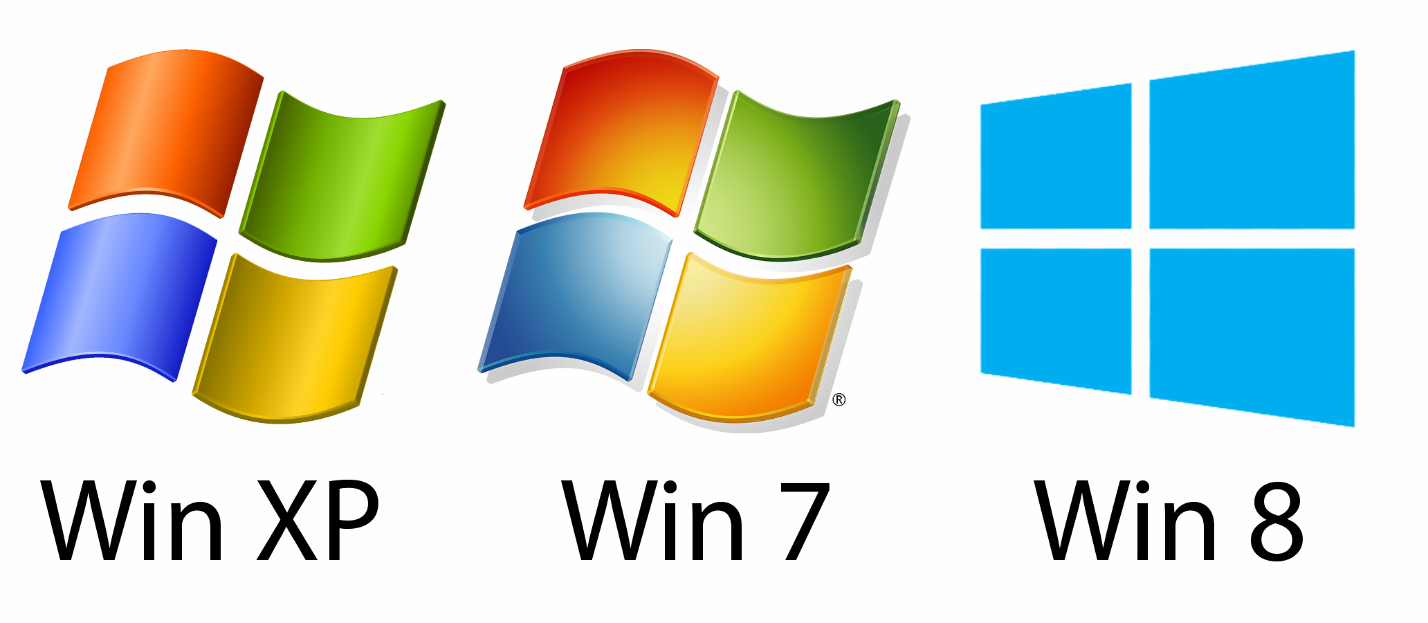
In short – Flat design replaces the realistic 3d style of skeuomorphism with flat, mostly one-colored elements. It takes some attention off the design and redirects it to functionality.
Flat design is a user interface that is mainly used on websites. It replaced the skeuomorphic style that most websites were using.
Skeuomorphism uses shadows, glows, textures and some other effects to make the elements look more realistic. That was considered beautiful back in those days.
Flat design doesn’t use any effects on the elements. It utilizes simplicity and minimalism to create a better functioning website. It doesn’t try to draw the attention of the user to the elements.
You can get a good preview of what both skeuomorphism and flat design are by looking at the evolution of Microsoft’s logo.
Flat design is responsive
Because of the way flat design websites show the elements to the users, responsive websites are much easier to create.
Responsive design plays a huge part in today’s websites. It wasn’t always like this though. In the past, when skeuomorphism was the leading design style, there weren’t many responsive websites. Even now, if you see a website that uses that design style, it’s probably not responsive.
In the past, with skeuomorphism, websites utilized a lot of textures for buttons and other elements. That makes it hard to resize them. To have a functioning responsive website, you will definitely need to resize some elements. It was sometimes hard to keep the same style.
A step back to a faster future
You’ve probably heard the saying “history repeats itself”. This one’s no different.
Just as electric cars existed before Tesla came, a version of flat design did exist in the past. There was just nobody to make it mainstream.
The design that seems to have inspired the flat design movement is the Swiss design style. This movement took place in two art schools in Zurich in the 1950s.
It’s much faster than skeuomorphic design. With the reduction of effects and textures, the load time for a flat design website is much faster. This is especially needed since more than 50% of visits come from mobile.
But is it here to stay?
A flat design website provides a much better experience than a website with skeuomorphic design. The most important thing to remember is that today’s children use tablets from a very early age.
The skeuomorphic design was created to guide people through a website, a button would have shadows and gradient colors, to attract you to click on it. With flat design, that’s all gone.
Websites have become a bit less interesting, but much more functional.
It seems like flat design is here to stay for now. There will be some upgrades happening to it and people will mix it up with other styles, but it’s not gonna go away any time soon.
What’s the best way to utilize a flat design?
Trying to build your own website? Don’t worry, there’s no need to pay a huge amount of money for someone to build a flat design website for you.
WordPress provides an easy way to implement flat design into it. There are many flat design WordPress themes.
But before you build your website, you need to make sure your hosting is good enough. Hosting providers now offer optimized hosting for WordPress, which is hosting that’s specifically for the WordPress platform.
Let’s have a look at some flat design WordPress themes.
#1: Flatsome
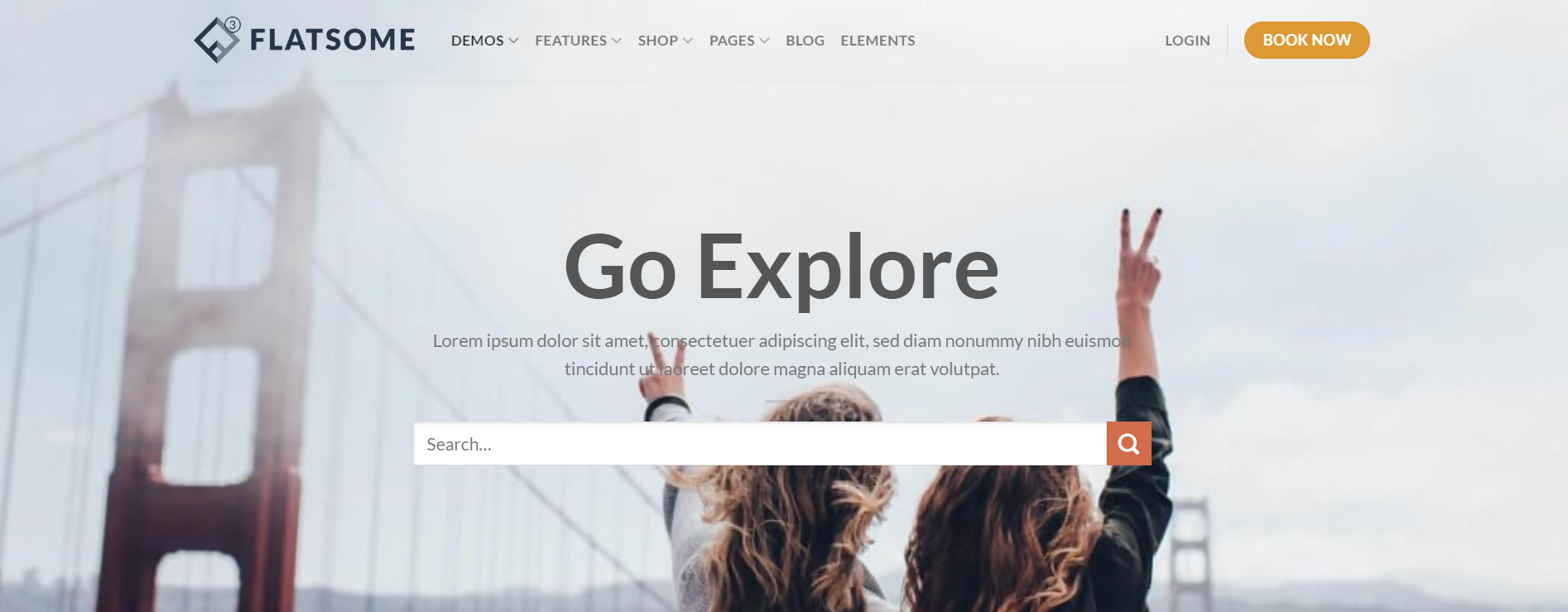
Flatsome is a highly versatile WordPress theme that can serve multiple purposes. It comes ready with demos for a few types of websites.
It’s mostly focused on businesses and online stores. That’s what most of their demos are for. But that doesn’t mean you can’t adapt it to whatever you need.
Flatsome also features a rigorous page builder that can help you build all kinds of pages for all kinds of websites.
It’s not hard to see why it has over 95,000 sales and an average rating of 4.8 out of 4800+ ratings.
The price of this theme is $59. You can find it here.
#2: Jevelin
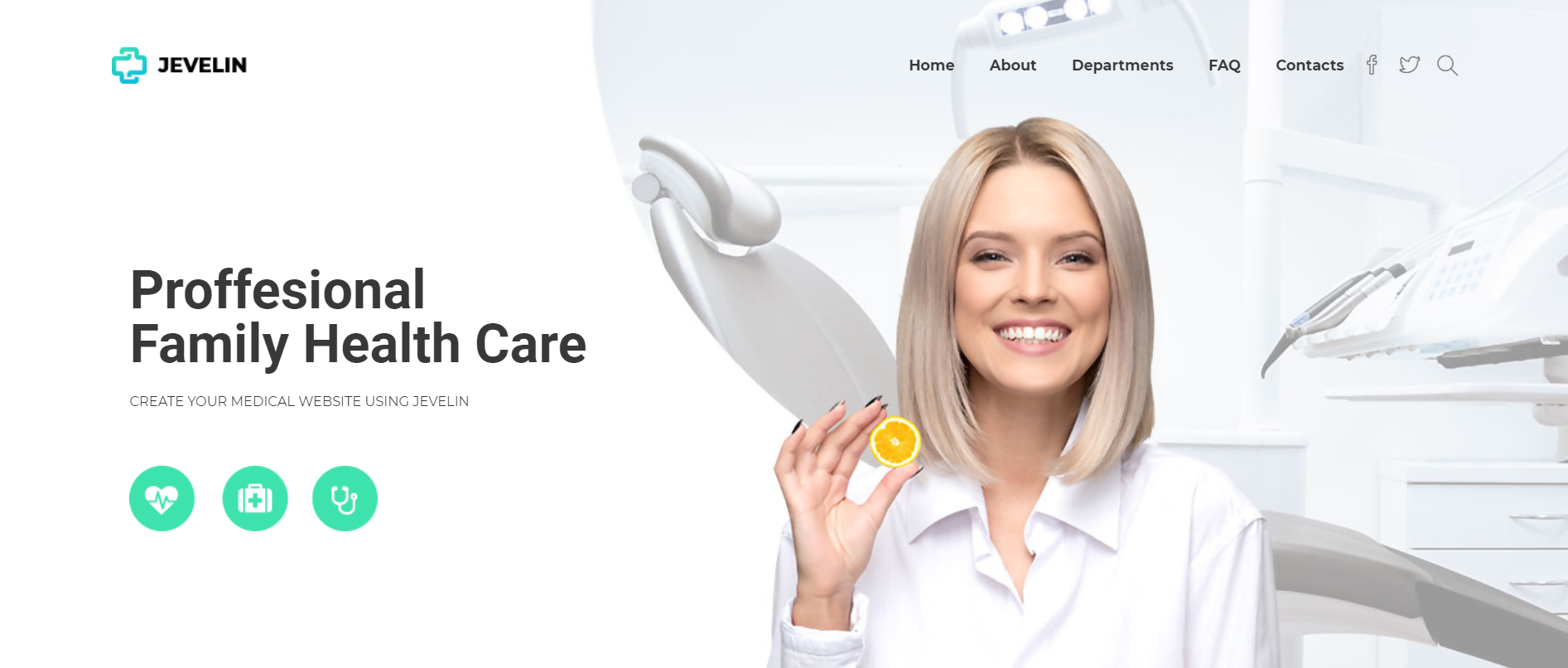
Jevelin is another beautiful flat design WordPress theme. It’s highly customizable and features a lot of demos that you can easily import.
The demos of this theme aren’t limited. There are demos for all kinds of websites. I’m pretty sure you could find a demo that will suit your website.
There are even guides on how to install this theme, bundled with video tutorials. You can really tell that this theme is focused on ease of use.
This theme was sold more than 7800 times and the average rating is 4.6, based on 150+ ratings. You can find the theme here.
#3: Divi
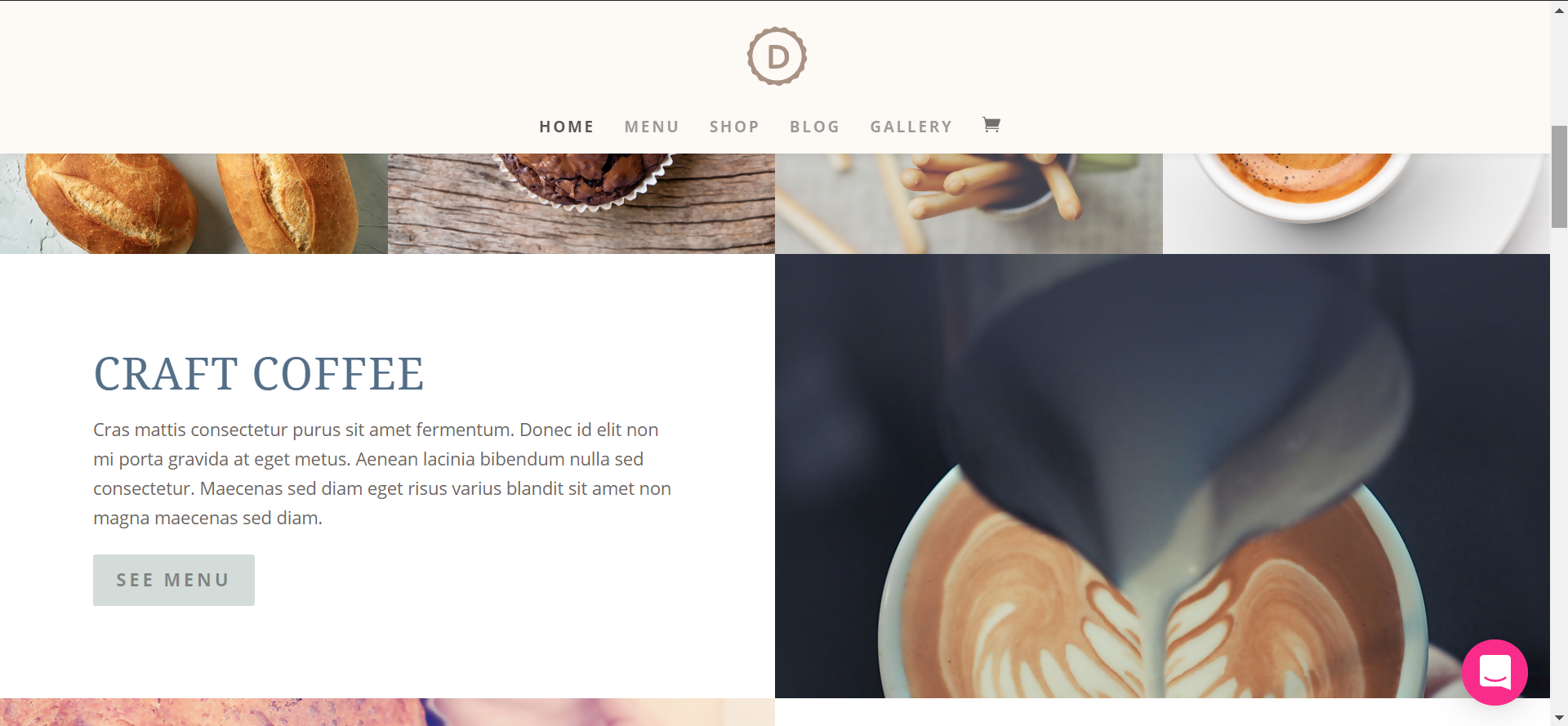
Divi is more of a web builder than a theme, but it does come as a WordPress theme, it’s just very advanced. It massively uses flat design for all its demos and templates.
It’s highly customizable and usable for any kind of website. Due to its nature of being a mix between a WordPress theme and a web builder, you can’t go wrong with Divi.
Divi doesn’t sell like a normal theme through Themeforest. It’s sold on Elegantthemes’ website, in a package that includes all their themes and plugins. But, there is a free demo you can try before you buy it.
To purchase the membership, go to Elegantthemes’ website.
#4: Story
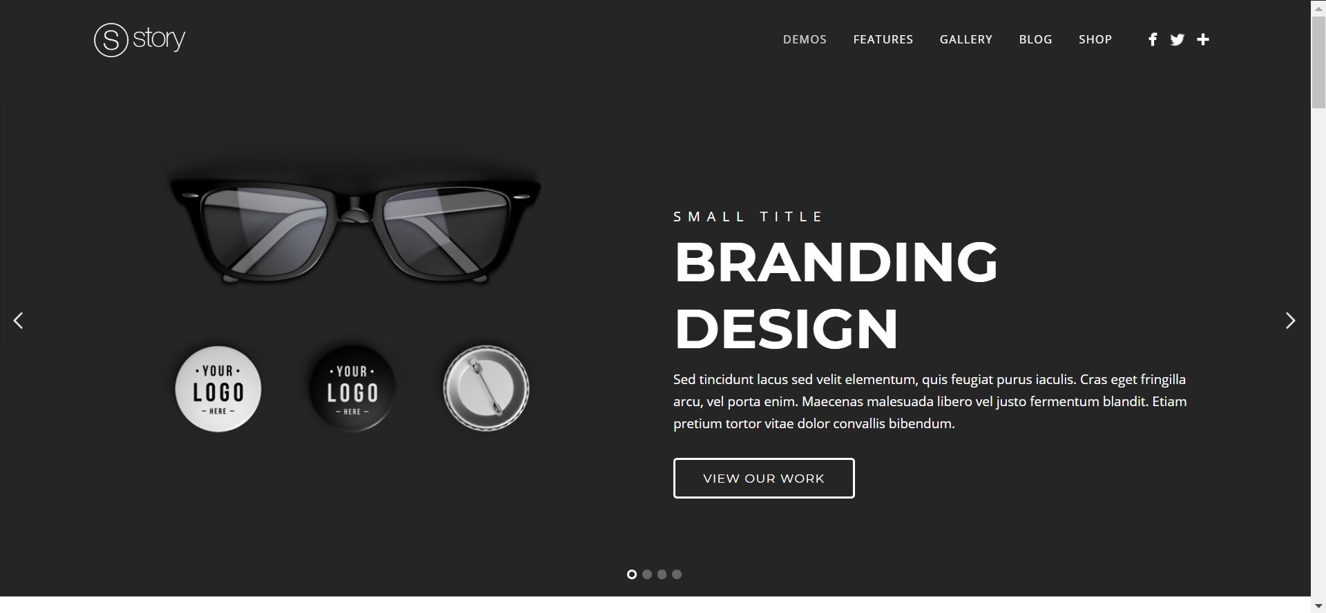
Story is a multi-purpose flat design WordPress theme. It features a full-screen slider at the top. The slider offers a lot of customization options such as content position, colors, CTA buttons and more.
They’re also very proud of their Advanced Portfolio Gallery. It features a choice of multiple types of portfolios, different layouts, columns, pagination and more.
They do have quite a few demos at hand for many purposes like photography, product, agency and more.
It has over 12,000 sales on ThemeForest, with a rating of 4.76 based on 656 ratings. You can find it here.
Flat Design is Here to Stay
Flat design is gaining more and more popularity since 2011 when Microsoft used it in Windows 8. After that, multiple fortune 500 companies like Google and Apple also started using it, so that helped set the trend in motion
It’s mainly characterized by removing unnecessary effects from the website and implementing simple and minimalistic styles. This helps the website achieve a faster load time and a better responsive design.
It didn’t originate in 2011 though, it was present throughout history in some form or another. The most similar representation of the flat design in history is the Swiss design movement in the 1950s.
Themes have been fusing WordPress and the flat design style for a long time now. A lot of flat design WordPress themes exist, but the 4 listed above are some of the most beautiful and customizable themes you can find.
And remember, if your website doesn’t have great WordPress hosting, it doesn’t matter which design style you use. It still might be slow.
