Structure-wise, I went for a small home page rather than the typical lengthy 10 latest blog entries and a sidebar. My new home page is made up of four main features: full content of latest blog entry, six titles of recent blog entries, another six titles of most popular articles, and a sidebar made up of my cheesy face and category navigation.
Design-wise, it’s grid; it’s grunge; it’s glossy; it’s illustrated. This design basically represents the fact that I’m learning how to design and learning to not rely on gradients or other Web 2.0-ish looks every time I get stuck. Out of all my designs, this latest one is closest to who I am as a person. I’m messy on the outside, but I’m secretly a member of The Organization For The Organized on the inside. (Basically, I’m a bit of a neat freak.)
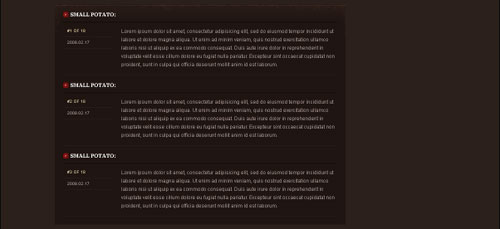
And now, the comments template:

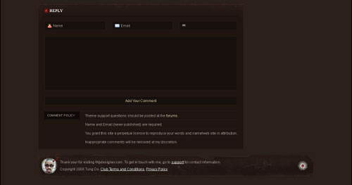
A look at the comments form and policy template:

The list of stuff below the comments form are the comment policies.
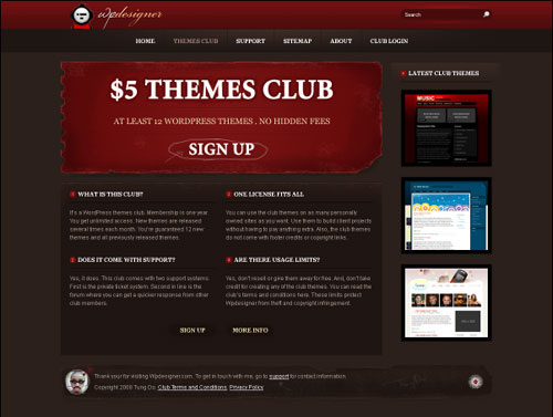
The themes club landing page:

There are several more templates to this redesign, but you’ll have to wait until I launch version 10.0, which will be soon by the way.
The Point of This Post
No, it isn’t to preview version 10. It’s actually a glimpse of what sort of themes are coming to the themes club. Despite the fact that I suck at designing :-), I think you’ll appreciate the level of details and personalized elements I’ll bring to the paid-themes market. For each future club theme, here’s what I’ll aim for.
I think I’m addicted to tweaking my own blog. I can’t help it. The WPDesigner version 9.0 dust hasn’t settled yet and I’m already busy hacking away at a version 10.0.
p.s. – A new theme will be released sometime next week.