Follow this WordPress Theme Tutorial Series from the beginning.
After styling the Sidebar, this tutorial series will be almost over. Already? Yes, but don’t worry. I’ll follow up with case studies (break down of how I created my themes).
Again, you don’t need the index.php file today. Open Xampp, theme’s folder, Firefox, IE, and style.css in Notepad.
Step 1
Type this under .sidebar{}:
.sidebar ul{
list-style-type: none;
margin: 0;
padding: 0 10px 0 10px;
}
Now that you’ve styled the parent unordered list (UL) tag for the Sidebar, all child ULs or nested ULs will inherit the same style. In this case, it’s none, zero margin, and 10-pixel side paddings.
For example:
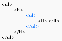
The second-level (or nesting) UL inherits the styles from the first UL. If you apply a border to the first UL, the second UL will also get a border.
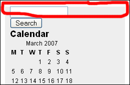
Save and refresh to see that your list items (LI) are no longer bulleted.
Notice how you add padding to the top and bottom.
Step 2
Type this under .sidebar ul{}:
.sidebar ul li{
padding: 10px 0 10px 0;
}
Here’s the padding now:
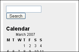
Why not add the 10-pixel padding to the UL tag in the first place? You need a way to separate one LI from another. Before the added padding to .sidebar ul li{}, there was no space in between the search form and calendar and no space in between Calendar and Pages. The spacing in between each block is what 10-pixel top and bottom paddings for .sidebar ul li{} are for. If the UL tag had padding for all four sides instead of just left and right (0 10px 0 10px), you would end up with a 20px top padding or 20px bottom padding in trying to separate the LIs after padding the UL. Get what I’m saying?
If you don’t, go ahead and add top and bottom padding for .sidebar ul{}.
Step 3
Type this under .sidebar ul li{}:
.sidebar ul li h2{
font-family: Georgia, Sans-serif;
font-size: 14px;
}
Remember that styling the sub-heading under .post{} didn’t matter because you were targetting sub-headings only under .post{}? Now, you’re styling the unaffected sub-headings in the Sidebar. Here’s the result:
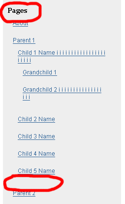
That’s how my Pages links listing looks. You probably have only one link, About. I added multiple links or page levels to my offline WordPress install to test and see how lower level links would look. Notice the unnecessary extra padding at the bottom that I circled. That’s a perfect example of style inheritance. Instead of 10 pixels, it’s 20 pixels.
Because you added padding to .sidebar ul li{}, the lower level LIs inherited that padding. To fix it, do Step 4.
Step 4
Type this under .sidebar ul li h2{}:
.sidebar ul ul li{
padding: 0;
}
The consecutive ULs in .sidebar ul ul li{} indicates that you’re targeting the lower level LIs. Again, when all values are 0, you don’t need the px suffix.
Here’s the result:
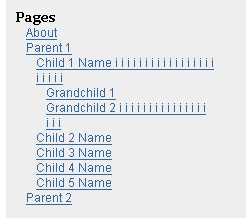
The line spacing is too close so let’s make the line height equal 24px.
Add line-height: 24px; to .sidebar ul ul li{}.

By the way, if you’re getting extra spacing under the search form in Internet Explorer. Add form to:
body, h1, h2, h3, h4, h5, h6, address, blockquote, dd, dl, hr, p{
margin: 0;
padding: 0;
}
like this:
body, h1, h2, h3, h4, h5, h6, address, blockquote, dd, dl, hr, p, form{
margin: 0;
padding: 0;
}
Step 5 (Optional)
Do this step if you want the calendar dates to stretch and cover the full sidebar width. Your calendar currently looks like this:
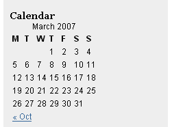
To style the calendar, find out tag it’s sitting in and what the name or id of that tag. To do that, go to View > Page Source or Source. Your sidebar is at the bottom so go to the bottom of the source codes and look for the Calendar.
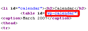
Now that you know the calendar sits in a TABLE tag with wp-calendar as id. How do you target the wp-calendar table in in the style.css file?
table#wp-calendar{} is the answer. Why? Earlier, you learned to use the pound sign when styling DIV named with an id instead of a class. In this case, it’s a table instead of a DIV, with an id value, wp-calendar.
#wp-calendar{} would work because it’s unique and WordPress doesn’t use #wp-calendar for any other tag. But, you should try to be specific when you can. If you want to be more specific, use .sidebar ul li table#wp-calendar{}. Even more specific? Fine, use .sidebar ul li#calendar table#wp-calendar{}. That’s because the list item (LI) containing the Calendar sub-heading and Calendar TABLE has an id named calendar.
Now that you know what to use, how do you make the table stretch? Use width: 100%; for the table.
Type this under .sidebar ul ul li{}:
table#wp-calendar{
width: 100%;
}
Save and refresh. Here’s the result:
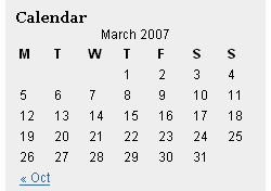
width: 100%; because you want the Calendar table to adjust to the width of the Sidebar, no matter how many pixels you want to change the Sidebar too.
It doesn’t look good, but you’re learning how to do it, in case you want to. This calendar needs more styling to look right. Hint: Look in source codes again, find out what tags under the TABLE that you can style.
That’s the end of today’s lesson.